Menu
Open
Close
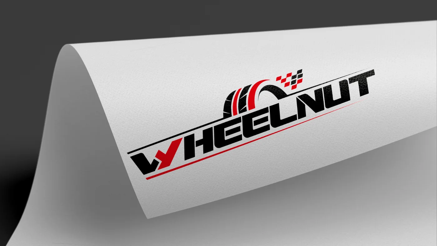
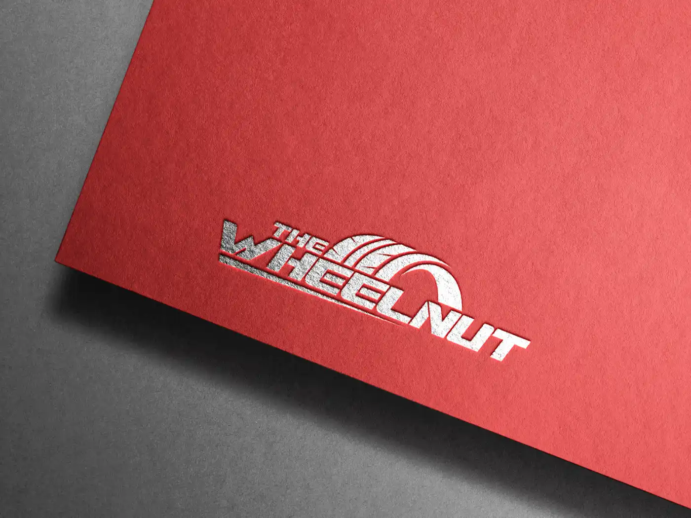
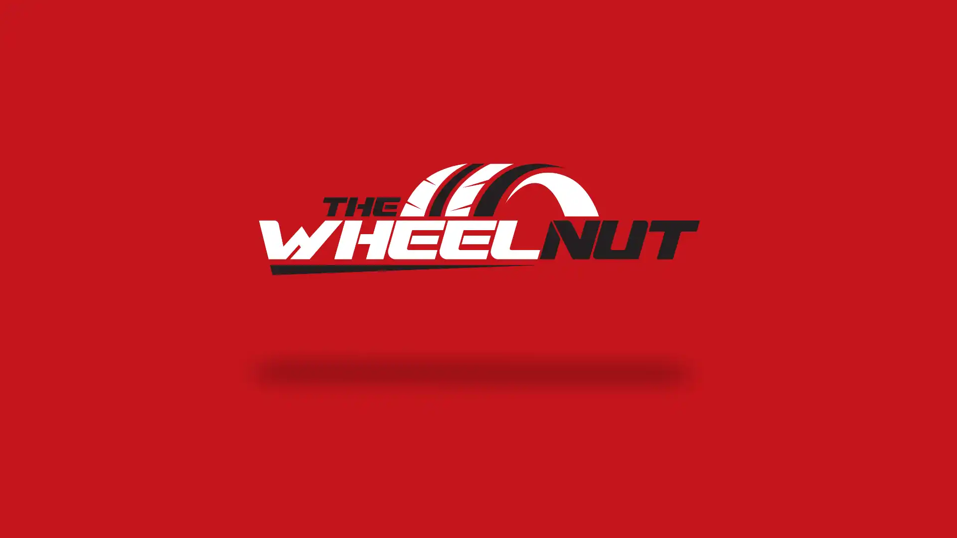
The Wheelnut
A logo for an online motor racing journalist. This was a fairly straightforward brief; the name's length admittedly creates some unique challenges requiring unique solutions. The logo needed to reflect ‘motor racing’. So the red and black colours were an obvious choice. The inclusion of a slightly angled typeface gives the logo movement. This brand would cover all forms of motor racing so it had to be seen to cover all disciplines.